


Saint Roastery
Brand Identity, Print & Packaging Design
The studio took inspiration from the current coffee industry aesthetic, characterized by clean minimalism.
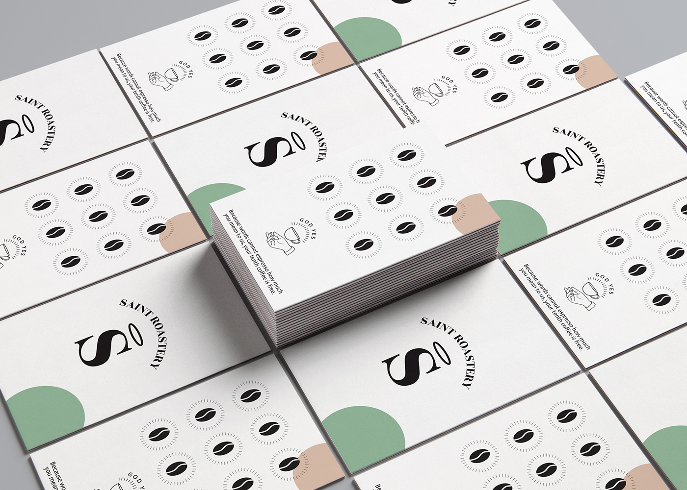
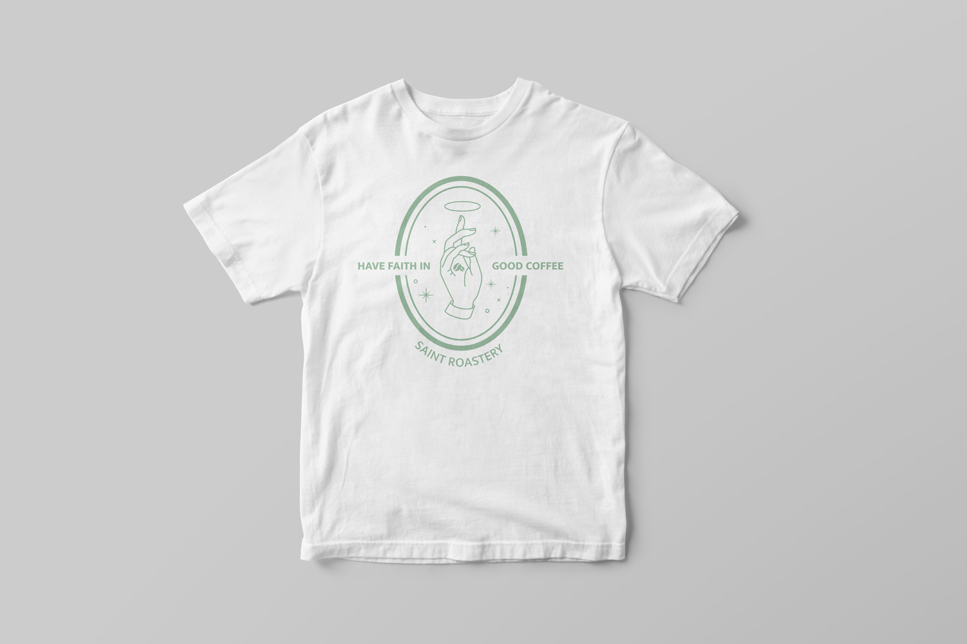
The name was the starting point for the creative process and offered a chance of reinterpretation through different expressions and hyperboles which gave form to several illustrations and tags and led the way to a visual universe of amusing exaggerations.The solution for the logo was to create an identity in which the letter was a metaphor of sensibility and wisdom in contrast with the fun illustrations that accompany the graphics.The hand in it’s multiple gestures and the halo, serve as a unifying factor between the different graphic elements.
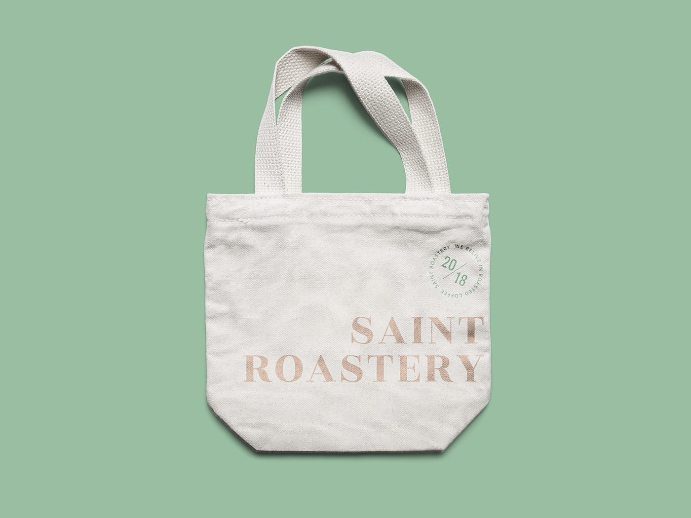
The color green is not by chance. The color was originally found only on special ceramics, created by a thinly applied glaze that transformed iron oxide from ferric to ferrous iron as it fired in the oven. The name of the color is "Celadon" and it is supposed to be the name of a fictional French character who adorned his clothes with ribbons in this color. For centuries, in China this hue of green was called "mi se", meaning the mysterious color.


Studio - 441 Design Studio
Instagram - https://www.instagram.com/441designstudio/
Website - www.441designstudio.com
Design team- Anca Dumitrescu, Alina Filipoiu, Serban Leafa, Silvia Nedelcu
Photograph- Vlad Creteanu
Saint Roastery instagram - https://www.instagram.com/saintroastery/
Coffee shop adress - 26 Maltopol street, Bucharest


